Am I Still CovereD?
Microsite and online resource to help inform the public about the impact of the Senate’s 2017 healthcare bill.
Website: www.amistillcovered.com
Facebook: www.facebook.com/amistillcovered
Twitter: www.twitter.com/amistillcovered
#amistillcovered
The Problem
In late June 2017, the U.S. Senate released the first version of the Better Care Reconciliation Act, a bill to partially repeal the Affordable Care Act (ACA). An estimated 23 million Americans stood to lose health insurance, and older and low-income people would see their costs increase. Some Americans could also lose access to essential health benefits and could be charged more for pre-existing conditions.
As the bill quickly made its way through the Senate, many were left wondering how these new health policies would affect them:
Would I lose my coverage? How much will this cost me? Can I still afford my medical care?
That’s when I started getting texts from three concerned friends:

Solution
In a week, these friends and I had created AmIStillCovered.com, a simple microsite that answers questions about the BCRA bill and its amendments.
AmIStillCovered.com is a single page Javascript application, which was easy to host and allowed our policy team to directly make content updates as new amendments to the bill came out. The website was developed by Shu Chen.
We wanted to start by reaching a broad range of adult Americans who might be affected by the BCRA bill, but might have a hard time deciphering this complex policy.
My Role
As the sole designer on the team, I was responsible for the look, feel and usability of the site and all graphics. I took the site from a concept prototype to visual design deliverables, and conducted lightweight guerrilla user testing.
The team also included a policy lead and 3-person policy support team, a project manager, marketing manager, and developer.
Challenges
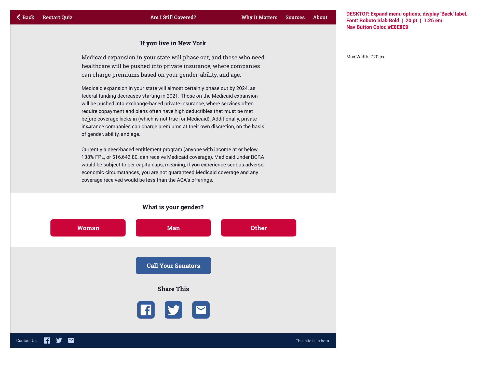
The main challenge of this project was time. To write, design and build the site within a week, there wasn’t much time for user research. Our policy expert team narrowed the scope to five key questions that might affect a person’s health coverage.
We also considered displaying a single answer based on all of the user’s responses to the five questions. But the bill was so new that it would have been very difficult for policy experts to create answers that weighed multiple factors at once. So to start, the site had to be structured to provide individual answers, question-by-question.
Design Process
Once draft content was in place, I created a simple wireframe prototype to demo how the site would work. I approached this mobile-first to keep the design as simple as possible, and because the site is meant to be shared primarily via social media.
Then, I explored several color and type directions:
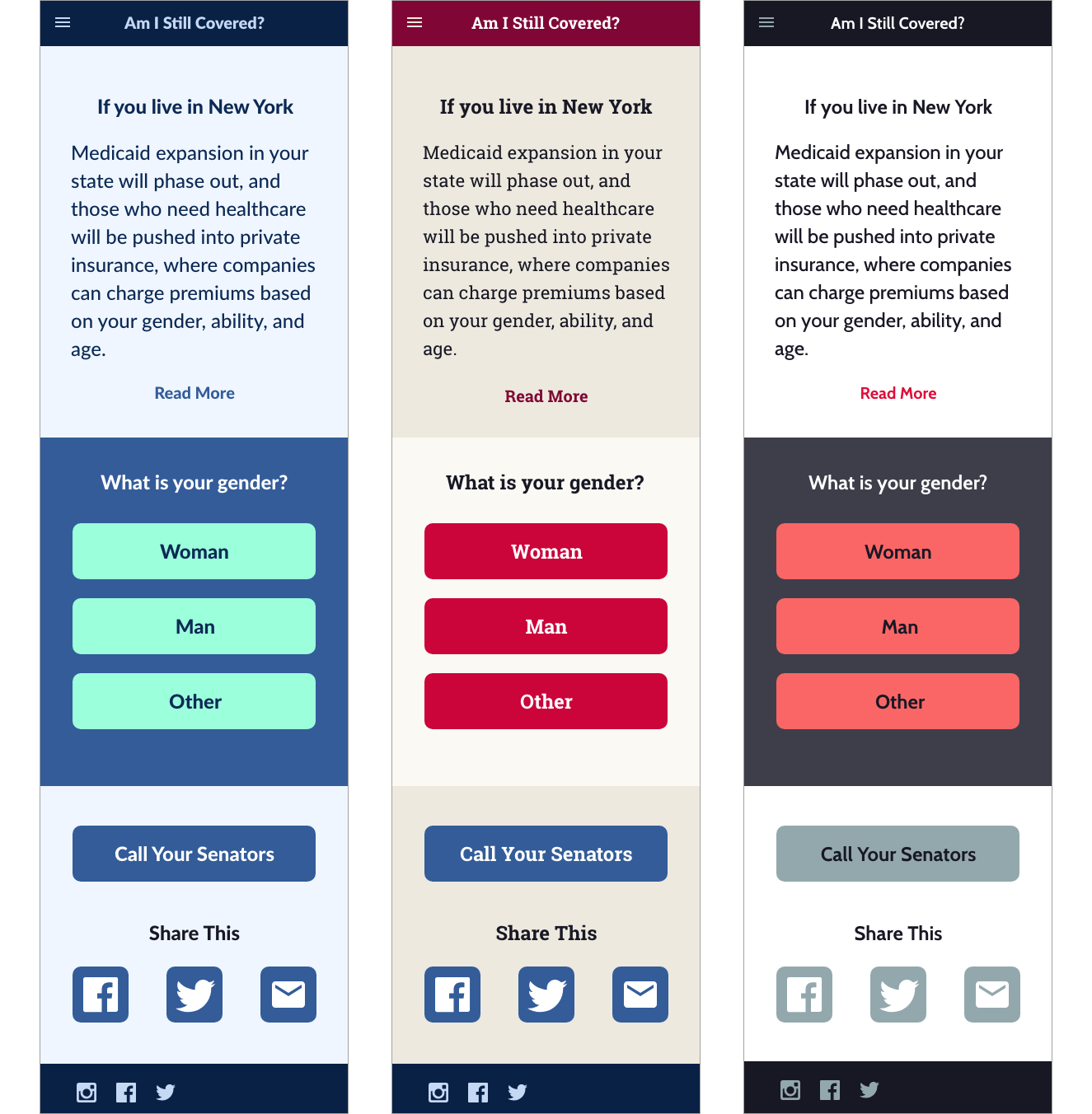
Option 1 is more healthcare-focused, Option 2 is more legislative/government, and Option 3 is more modern/neutral.
Before settling on a final visual design:


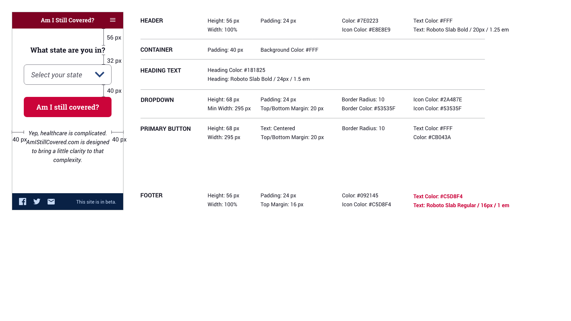
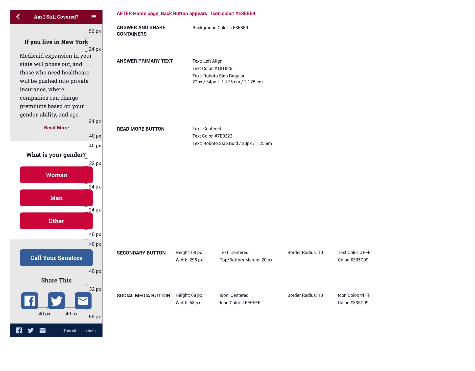
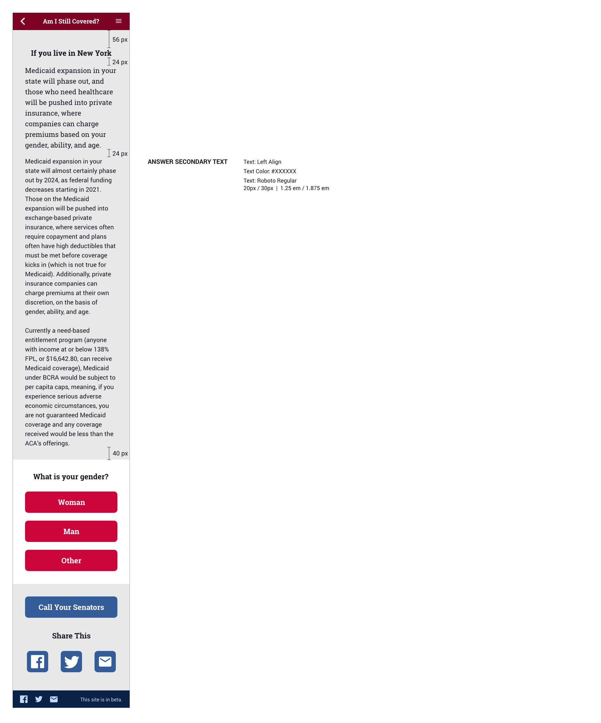
I needed to deliver the design as soon as possible, so I created a lean visual design spec for key pages:
And social graphics:

User Testing
After the launch of the initial site, I conducted an informal round of usability tests to observe how users navigated the site, gauge their reactions and identify any confusion.
Overall Takeaways:
Users are looking for a simple yes or no answer to the question: Am I Still Covered?
The most critical factor is pre-existing conditions, for those who have them. Consider asking about pre-existing conditions first.
Consider a format that allows users to answer all questions (or some questions if they prefer not to answer). Then surface the answer that is most critical to them.
“If I’m not covered based on one key factor — whether it’s my age or a preexisting condition — then I’m not covered at all. It doesn’t matter to me what the other answers are.” - Chris, 64
Content Findings
BCRA is not a recognizable acronym. We should always explain what BCRA is on every page, and/or refer to it as the “Senate Healthcare bill”.
Users did not want to read longer paragraphs of text; they prefer bullet points. Users are looking for very direct, simple points that answer whether they’re covered or not.
Users wanted more information about how their coverage would be affected based on where they live.
Design Findings
Some users did not realize that there were additional questions, because the next question wasn’t visible within a laptop browser window and there were no indicators of multiple questions.
Some users were looking to click a button that says, “Am I Still Covered?” on every page.
To solve these navigational issues in a short time frame, with minimal development effort, I added labels to indicate the following:
Number of questions (1 of 5)
Number of answers (1 of 5)
and a Next Question button

Next Steps
After the Graham-Cassidy amendment, the Senate decided not to vote on the healthcare bill, and the project is on hiatus.
But if a version of this bill were to resurface again, I would:
1) Fix scroll issues: on click of an answer option, the page should refresh or scroll to the answer results section. The “Next Question” button should be clickable and, on click, scroll to the next question.
2) Consider rearranging questions. And if possible, consider a version that allows users to answer all the questions, then get the results that are most critical for them.
3) Continue to refine the content based on testing with users, so that all of the language used is clear, friendly and easy to digest.
4) Add graphics and data visualizations that make the content more engaging.